Industry
Financial
My role
UX/UI Designer
Timeframe
5 months in 2023
Product Type
Design System & Component Library
Goal
Create a scalable design system that ensures usability for both designers and non-designers, including the marketing team and writers.
Solution Highlights
Developed a component library with adaptable features to minimize redundancy.
Created an interactive Figma prototype for easy access by non-designers.
Designed a style guide with brand colors, accessibility tests, and design rules.
Impact
Enabled the client’s team to work more efficiently by providing reusable components and clear design guidelines, shifting focus toward solving user challenges rather than redesigning elements.
The client, a company undergoing a website refresh, wanted a scalable design system to align with their growing needs. I had already been designing components and pages for several months, but the growing number of components made scalability and consistency difficult to maintain.
Recognizing the need for long-term efficiency, the client requested a comprehensive design system and component library to streamline workflows. The primary goal was to ensure usability not only for designers but also for non-designers like marketing staff and writers, who needed easy access to design elements without extensive training in tools like Figma.
Build a cohesive design system and component library that improves design consistency, scalability, and ease of use across multiple departments.
Ensure the system serves both designers and non-designers.
Create adaptable components with reusable features to avoid redundancy.
Provide clear design rules and documentation that align with the client’s specific preferences.
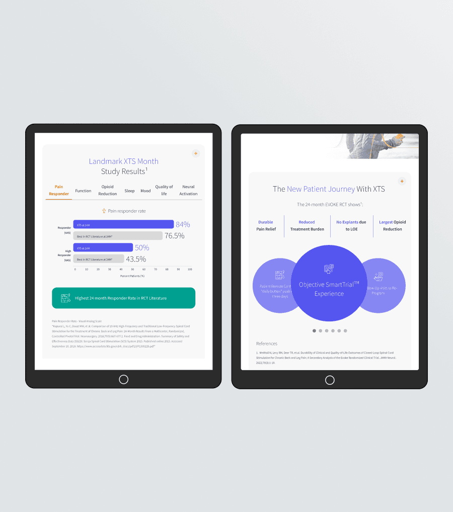
Used existing Figma files with previously designed components as a starting point.
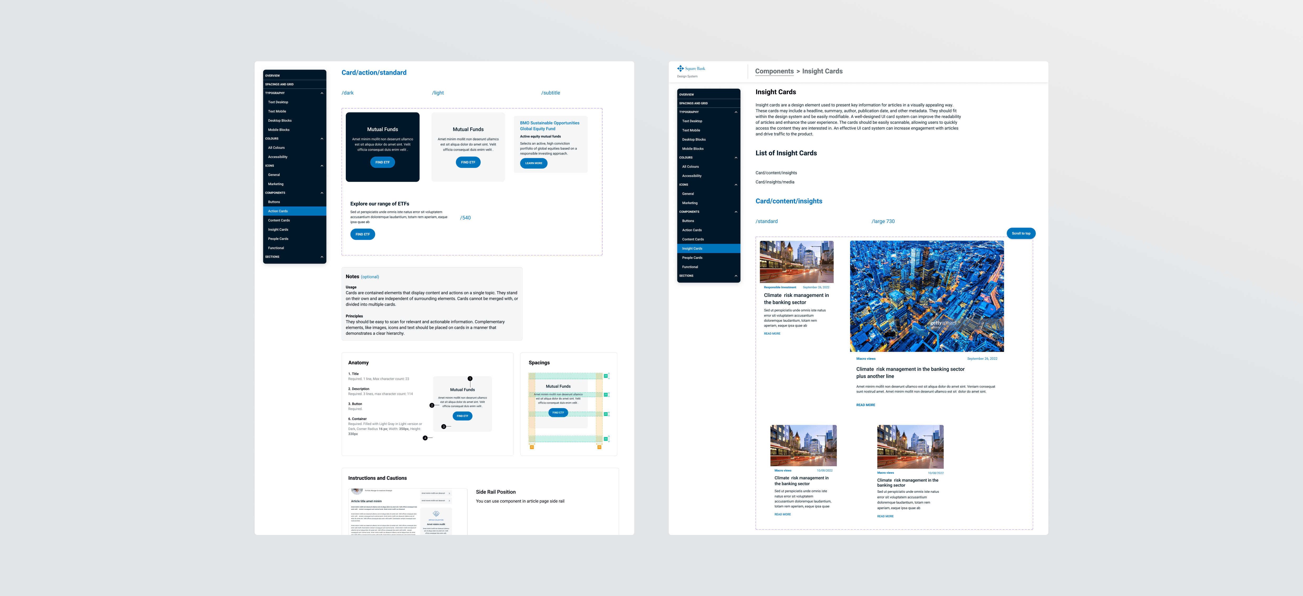
Organized components into categories to improve accessibility for stakeholders, including non-designers.
Enhanced component functionality by adding adaptable options to serve multiple use cases, reducing redundancy.
Built all components using auto layout to ensure responsiveness and easy scalability for future expansion.
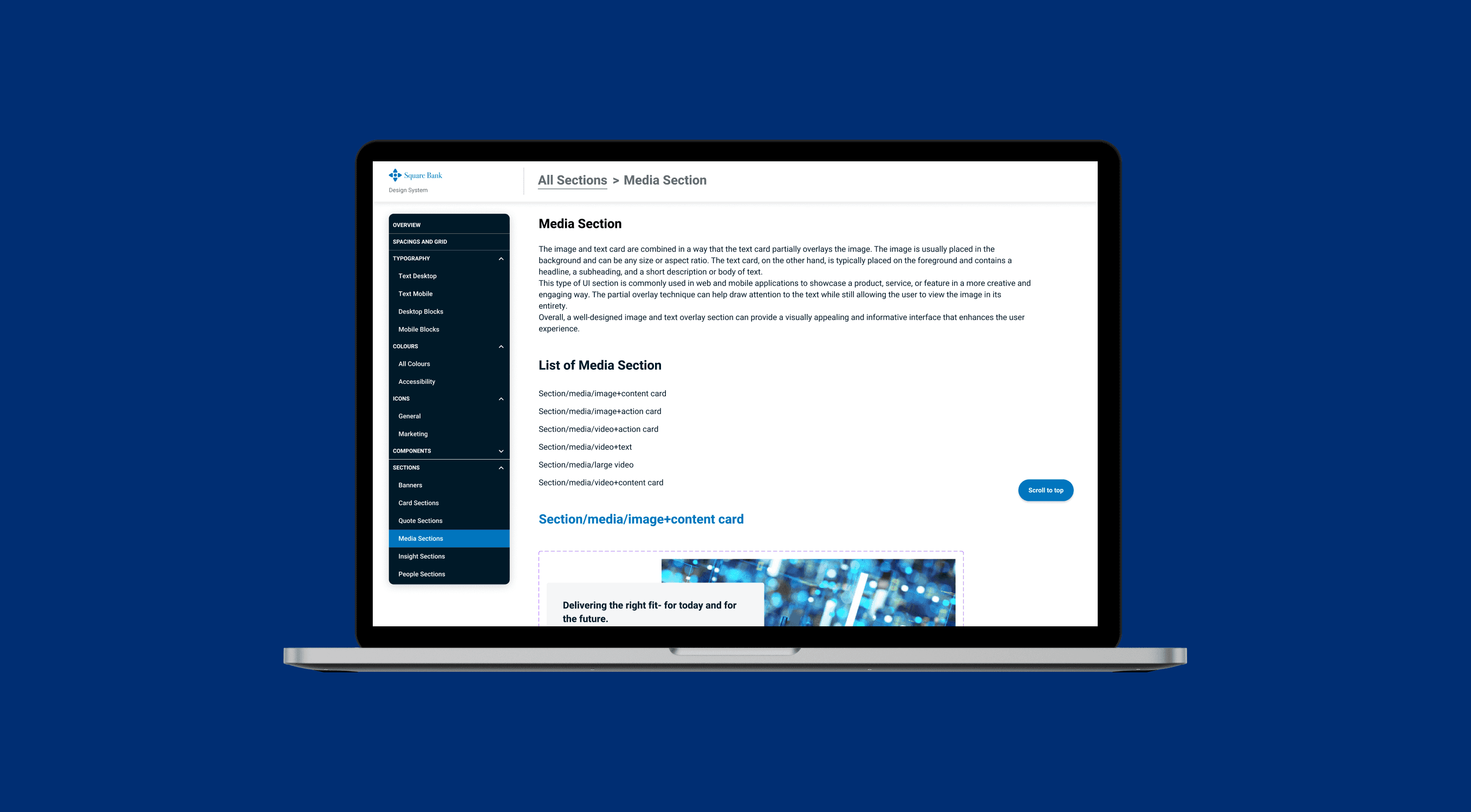
To make the design system accessible for all users, including non-designers, we created a Figma prototype as the framework. This prototype served as an interactive guide with:
A side menu for clear navigation across categories and subcategories.
Each subcategory displaying a list of components linked to their detailed sections.
A ‘go to top’ button for quick navigation on longer pages.
Developed detailed descriptions for each component, covering spacing, colors, and sizes to align with the client’s design rules.
Since plugins for automating descriptions weren’t effective due to the complexity of the information, I manually documented each component.
Integrated the client’s internal naming conventions to ensure alignment with their existing workflows and repositories.

Held weekly meetings with the client to showcase progress and gather feedback.
Incorporated the client’s feedback on component naming and structure to align with their internal systems.
Used Figma comments for asynchronous collaboration and to implement improvements on the fly.
Delivered a comprehensive, interactive prototype that houses the design system, style guide, and component library.
Improved efficiency: Designers, developers, and stakeholders—including non-designers—can quickly reference and use the components, reducing time spent on repetitive design tasks.
Streamlined workflows: The design system allows the client to focus on user experience challenges instead of component creation.
Clear internal communication: Teams can easily discuss and reference components during meetings, improving collaboration and decision-making.