Industry
Healthcare
My role
UX/UI Designer
Timeframe
6 months 2022-2023
Product Type
Internal App
Goal
Improve product presentation flow and simplify data sharing with doctors.
Solution Highlights
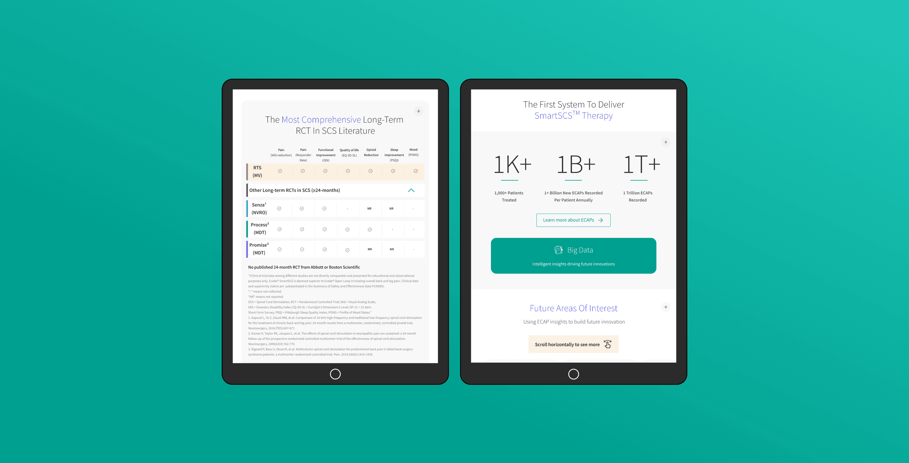
Designed a tablet-first interface with compact tabs to fit large data in limited space.
Implemented bookmarks for quick PDF generation and sharing.
Added in-content CTAs for seamless navigation between topics.
Impact
Streamlined the sales process by replacing PDF presentations with an easy-to-use app.
The client, an international medical device distributor, needed an internal web app for their sales representatives. Previously, reps used PowerPoint presentations during meetings with doctors, which was inefficient and time-consuming. The new tool needed to improve the flow of product presentations, simplify data sharing, and fit the reps’ tablet-based workflow.

Design a user-friendly web app tailored to the needs of sales reps and customers.
Create a navigation system for fast, easy access to extensive product info during meetings.
Enable seamless navigation through multiple sections.
Provide tools for reps to easily share information with doctors after meetings.
Conducted workshops with the client’s marketing and sales teams to understand user needs.
Reviewed previous PowerPoint decks used by sales reps to extract relevant product information and map it into modules for the app.
Started with wireframes in a standard SaaS-style layout but quickly realized it wasn’t working.
Given the data-centric nature of the project, we pivoted to working with real content and visuals to better fit the users' needs.

Tablet-First Approach:
Focused on tablet interfaces, since sales reps primarily use tablets in meetings with doctors.Handling Data with Limited Space:
Used underlined tabs to structure large amounts of data compactly without overwhelming users or requiring excessive scrolling.Easy Data Sharing with Bookmarks:
Introduced a bookmark feature that lets reps save specific sections. The saved content can be downloaded as a PDF and shared via email, ensuring fast follow-ups with doctors.Seamless Navigation with CTAs:
Added contextual CTAs within the content, leading users to related pages—this improved navigation beyond relying solely on the menu.

Collaborated closely with PMs and developers to align on feasibility and timelines.
Used Figma for design reviews, client feedback, and real-time collaboration with stakeholders.
Replaced PowerPoint presentations with a streamlined, easy-to-use tablet app.
Improved efficiency: Sales reps could present data faster and access key content with fewer clicks.
Positive client feedback: The client was especially pleased with the bookmark feature and the ease of sharing information as PDFs.

